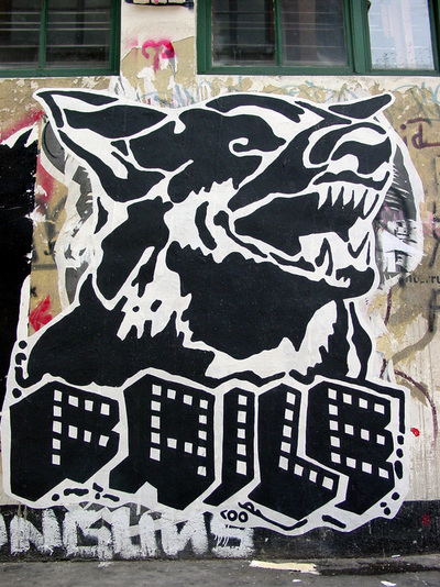
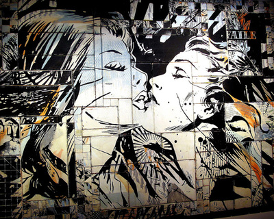
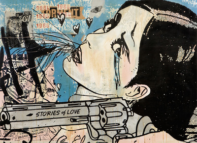
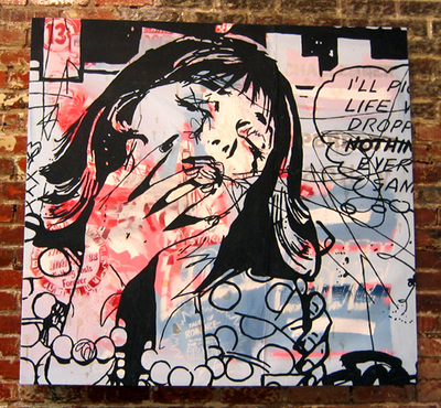
Faile's Work
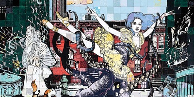
Faile's work look like it done on street walls to give the street art effect. He uses a lot of different colours but in every piece of work he does Faile has elements of black and white. His work is always very busy but in every piece the viewer is able to identify the main bit, which is often a person or animal.
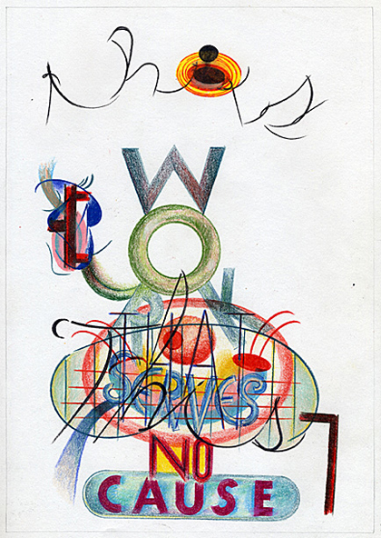
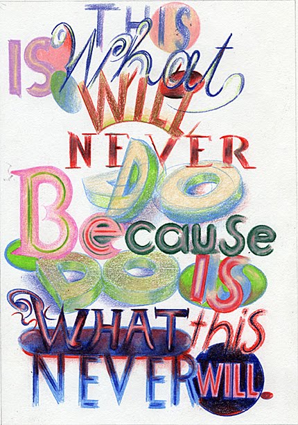
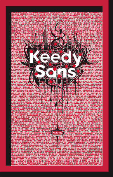
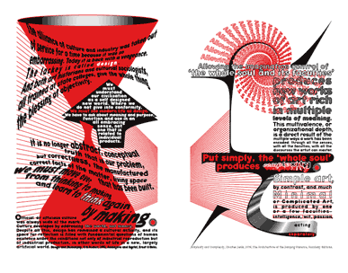
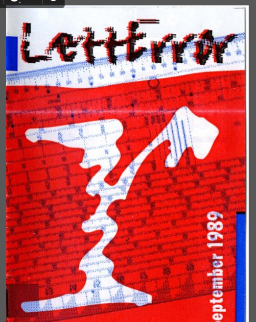
Jeffery Keedy
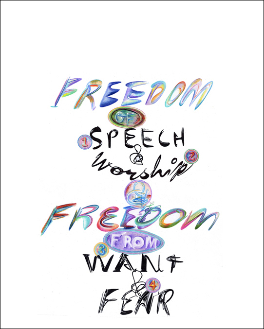
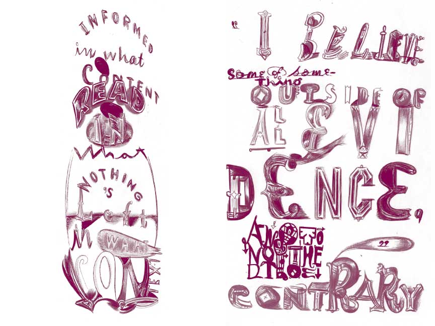
Jeffery Keedy uses a lot of red in his work, I think this looks effective because it makes the pieces stand out but it doesn’t look too much. From Jeffery Keedy's work I will be focusing on the style of the text and the way he has designed it around an image. When I collect photos I will be looking at urban street art to get the effect of the text joining together and all being part of one image.
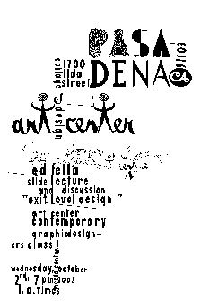
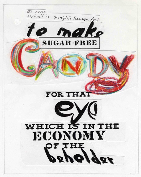
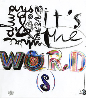
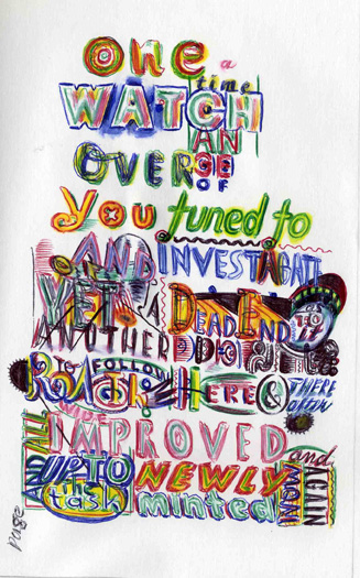
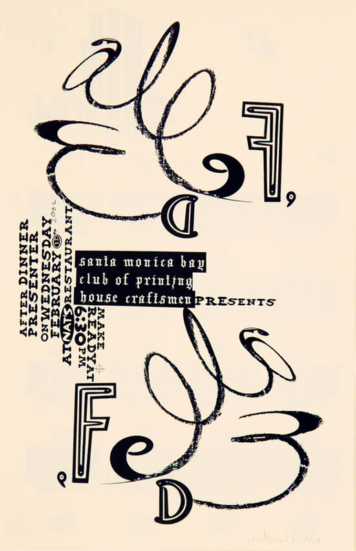
Ed Fella
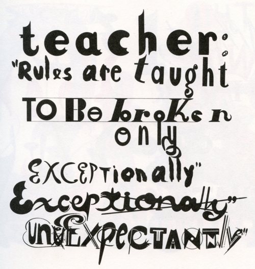
Edward Fella is an American graphic designer and an artist, he created the Out West type in 1993. His work is held in the collection of the Cooper-Hewitt, National Design Museum, the Brauer Museum of Art, and the Museum of Modern Art. Fella was born in Detroit, Michigan. He learned about commercial art while a student at Cass Technical High School. He received his Master of Fine Arts in design at Cranbrook Academy of Art, which he started when he was 47. He quit his commercial art job to create his own art and he taught at the California Institute for the Arts. From Ed Fella's work I am going to be focusing on the shape and colour of his work. Ed Fella's work is usually in a square shape because when he started out Polaroid cameras were around so they only printed photos off in a square shape because I think this looks really effective. I also like the way he has used colour on some words to male them stand out but added elements of black and white text.